Salt Lake City Public Utilities
The public utilities department for Salt Lake City was looking for a on premise installation and setup of SharePoint 2013. This installation was part of the overall effort by the broader city to use SharePoint as a city wide Intranet.
Services:
Wire-frames, Responsive Design, Prototype, Front End Development
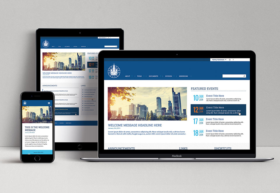
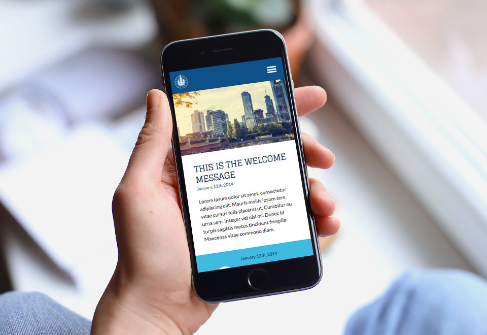
Responsive Designs
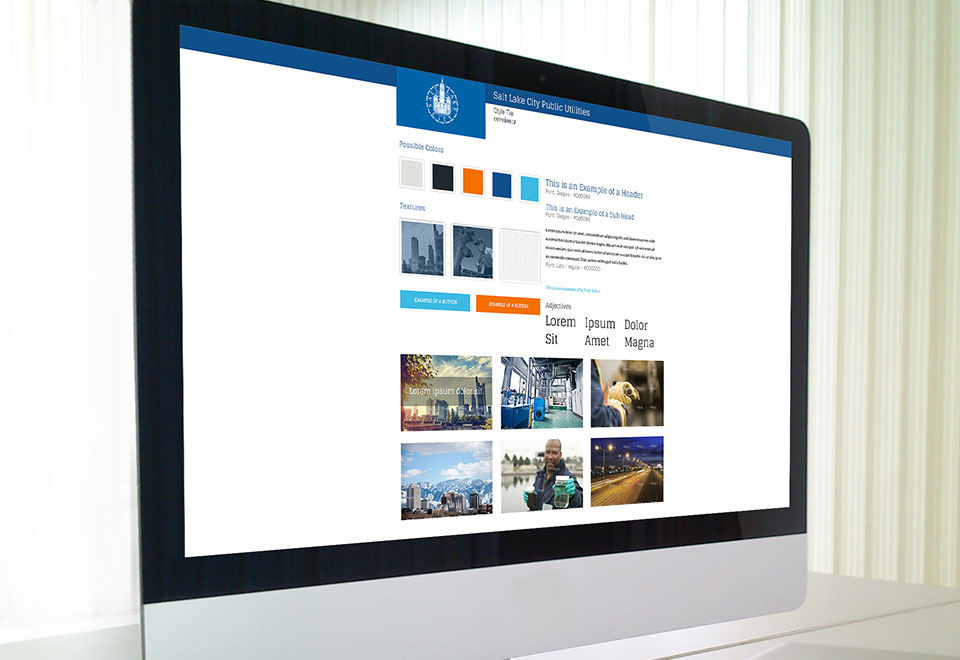
The Mood Boards
With little more than a logo and a single color, the creative direction was unrestricted. So I created a mood board with a masculine color palette, clean layout and a nice, smart slab serif font.
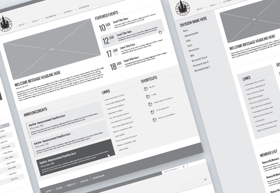
Wireframes
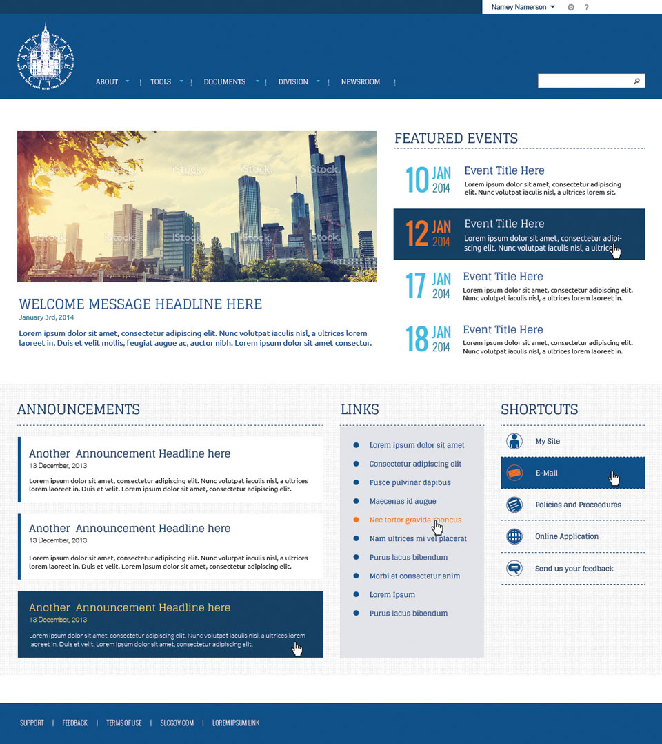
This intranet site was mostly to allow the public utilities to manage their documents appropriately. There were many files and folders out on their file share. This Intranet solution was to allow for the management of these documents in a true document management solution.
Responsive Designs
With the core need of the intranet being document management, the site would end up being quite text heavy. So subtle visual groupings were important and most of the fun was in the use of typography.
Prototype
The process was not included in my responsibilities for this particular project.
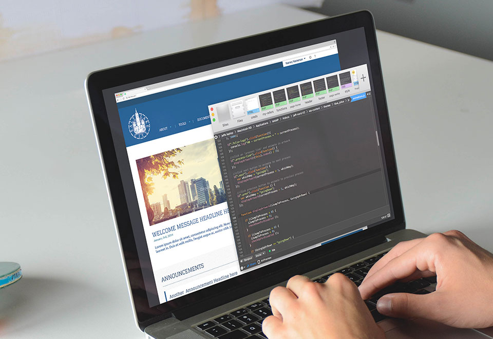
Development
I built working HTML and CSS with bootstrap before I handed off the code to the back end developers to be integrated into Sharepoint. I also handled all CSS trouble shooting after the integration.
Illustration
The process was not included in my responsibilities for this particular project.
The Result
The end result was a clean, typographic and well organized intranet that was just the right tool for the job.